7 Ways to Improve Your Lettering

Hellllooo fellow letter-ers! In this post, I will give you some ways to improve your lettering when you are starting out (& forever). I’m sure you can guess what the main point here is- and it’s to practice as much as possible.

Here are 7 ways to bring lettering practice into your daily life!

Grocery Lists (& all other lists)

Anytime you make a list, you can use it as an opportunity to practice lettering. The more you write in the fonts you want to learn, the more muscle memory you build, and the better you become at it.

Planner

Consider taking something like the Bullet Journal method up. It is easy to adapt to your needs, and there is an abundance of opportunity to practice all kinds of lettering.

Keep a Practice Notebook Nearby

Like most things, if it’s within arms reach, you’re more likely to remember to use it. I have a notebook I have been using for practice for a while, and it is a great way to see your progress, and perfect whatever word or phrase you are trying to letter before writing it on the final product.

Purchase Pre-Made Practice Sheets

There are lots of resources out there for practice sheets. I have several modern calligraphy (brush lettering) sheets you can check out here in my Etsy shop.

Look For New Fonts

Every business considers font when making their logo, creating menus, creating store displays and signs, or making anything else that their customers will be reading. Keep your eyes open for new or unique fonts and take pictures of any you might want to try and re-create.

Visit DaFont.com

Click here to be sucked into font vortex. Pick one (or eleven) to try!

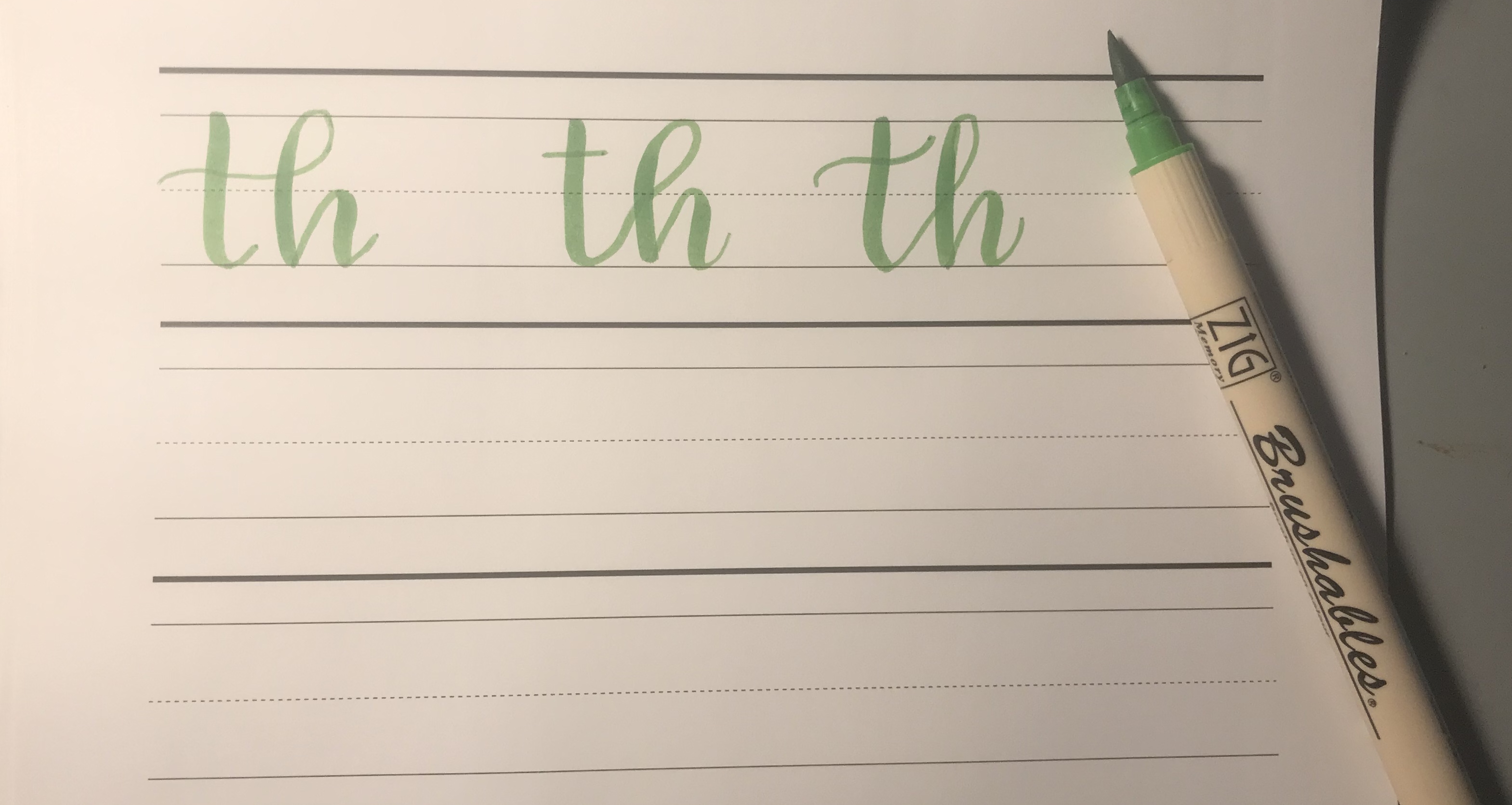
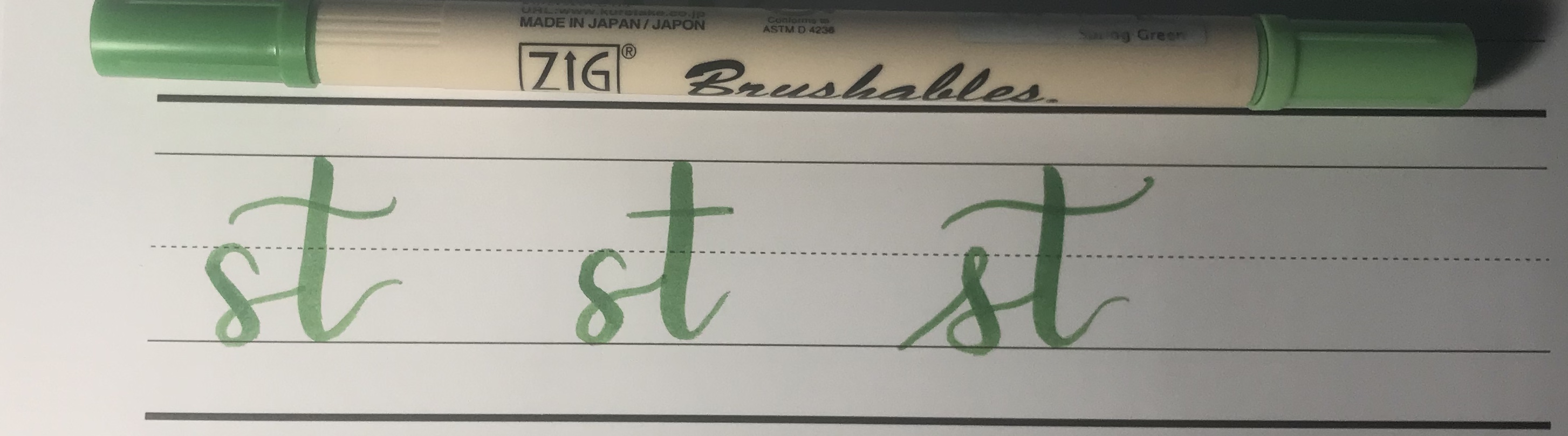
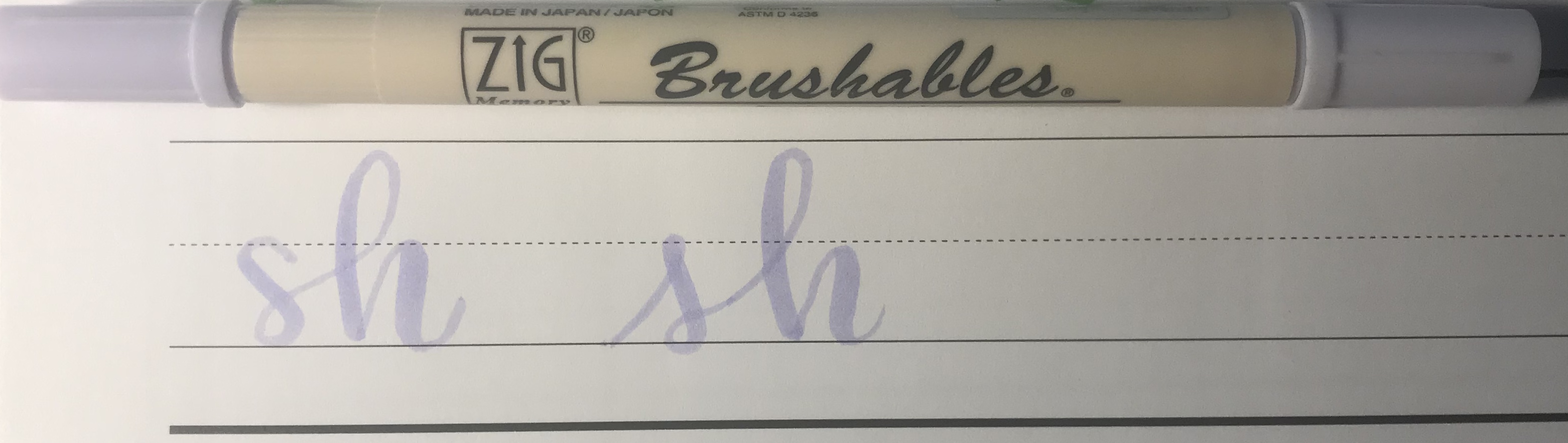
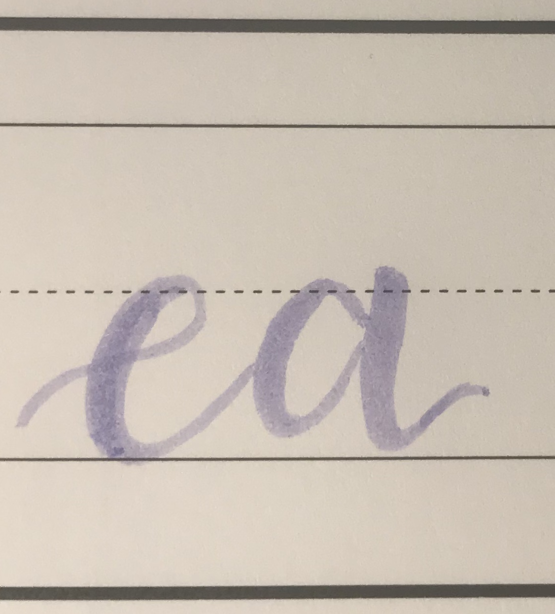
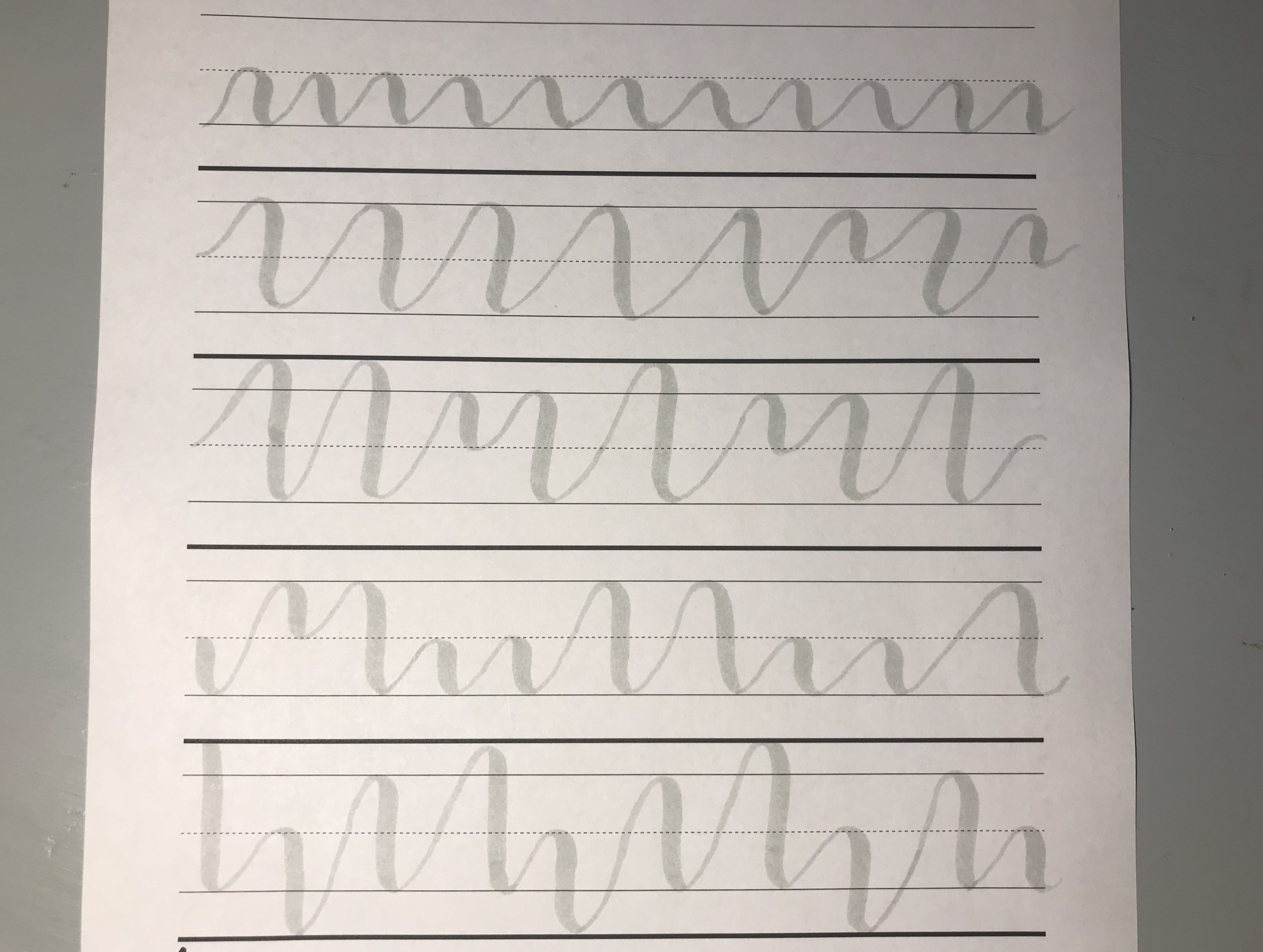
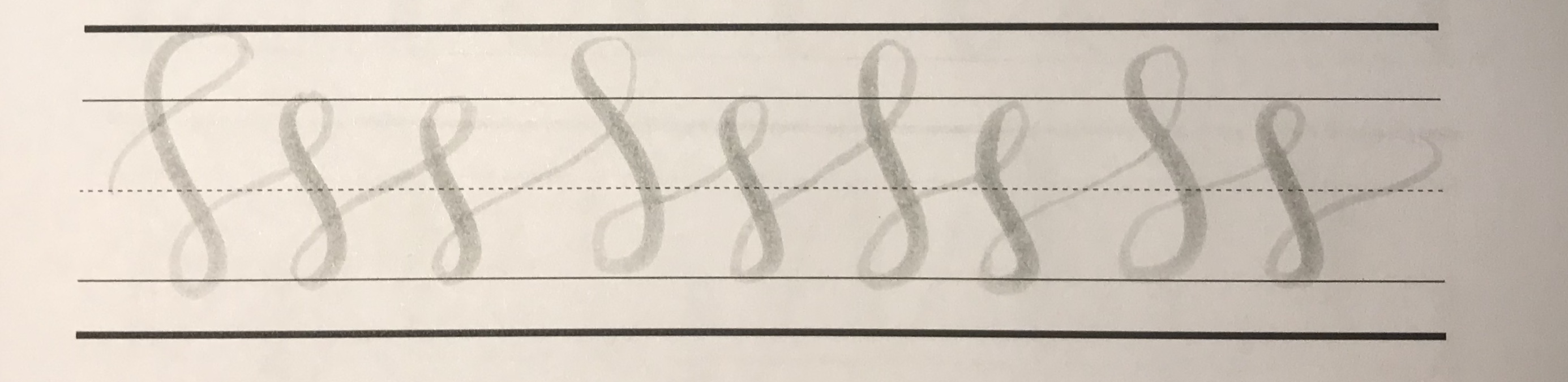
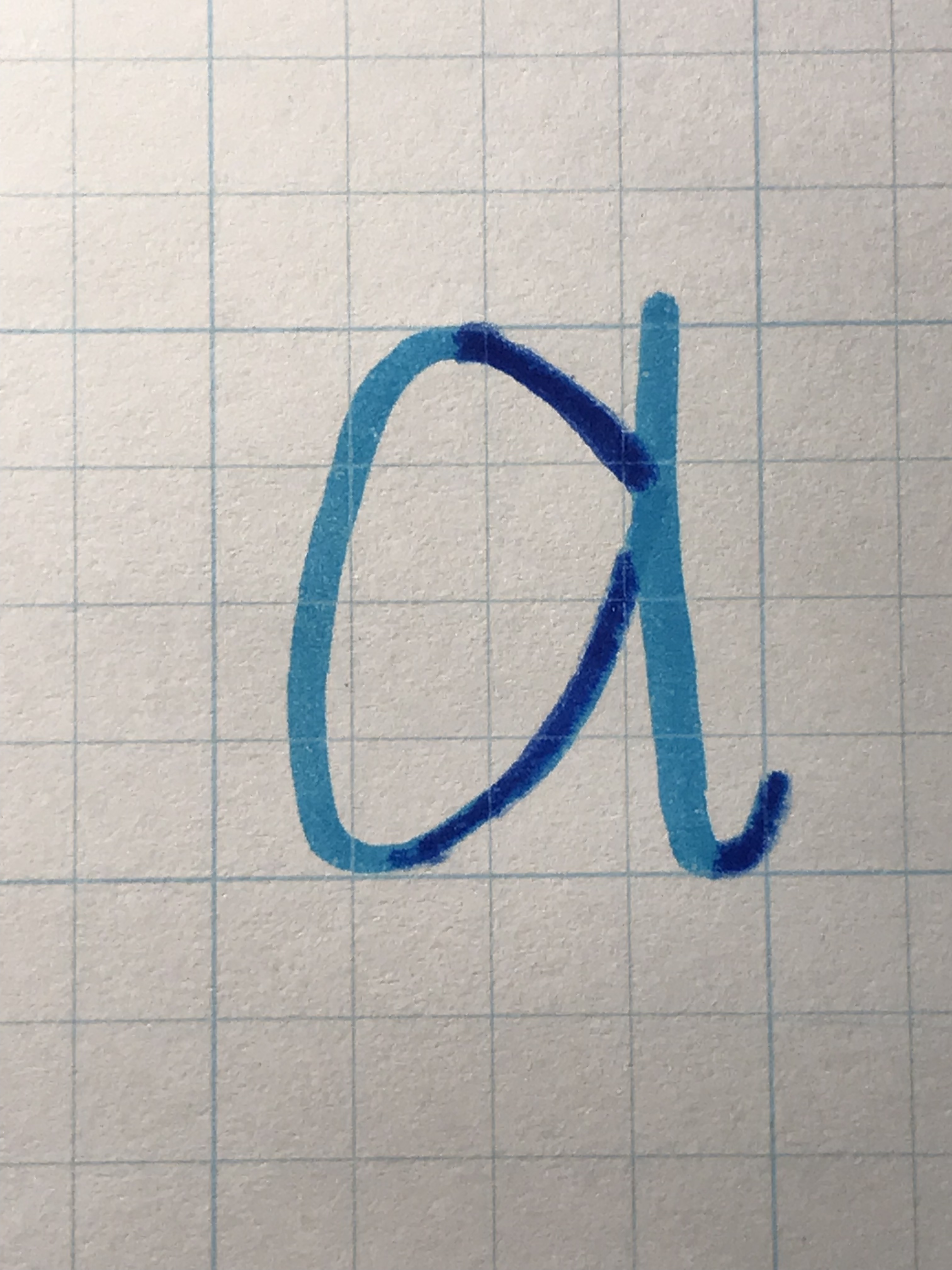
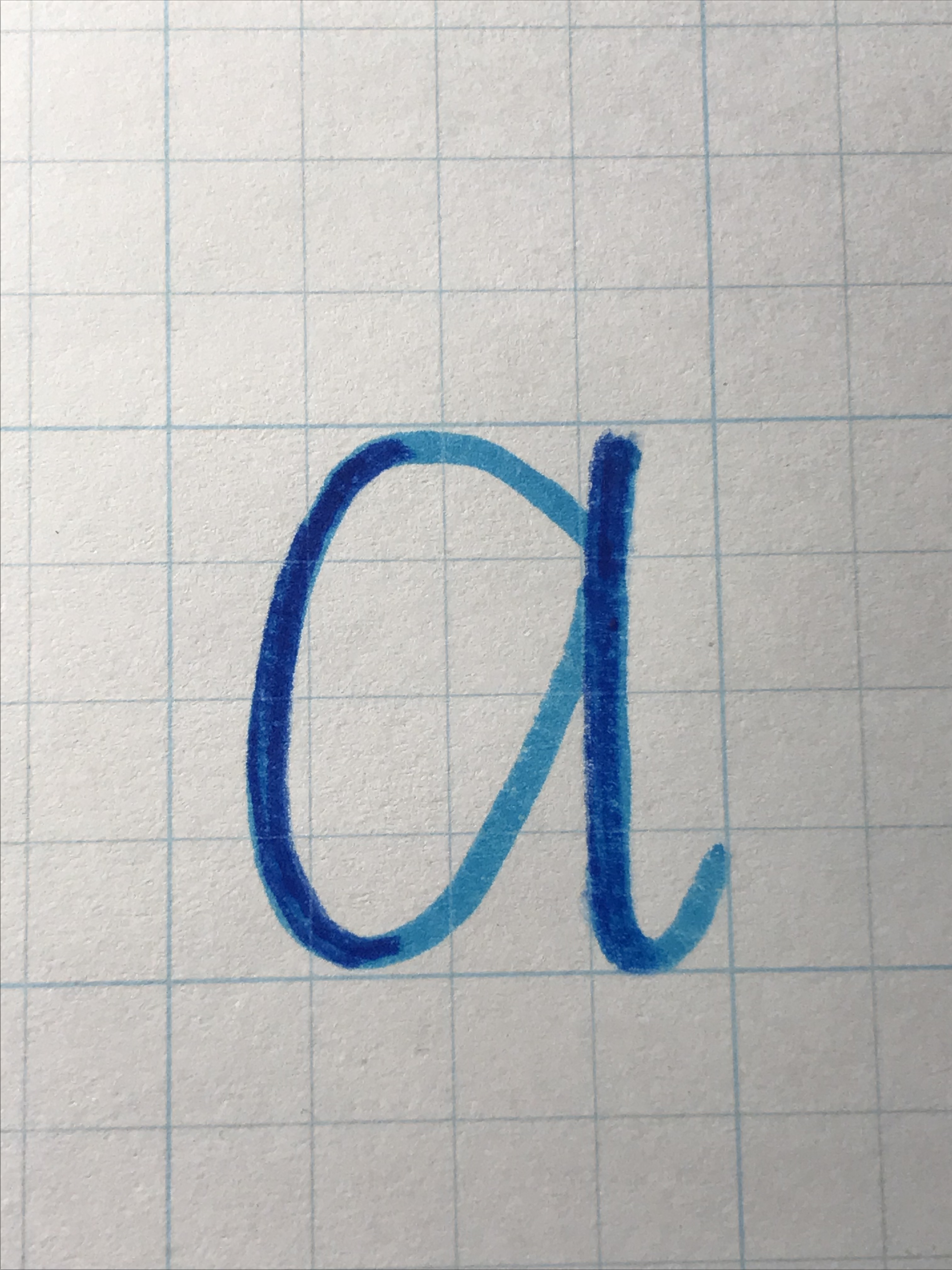
One Letter at a Time

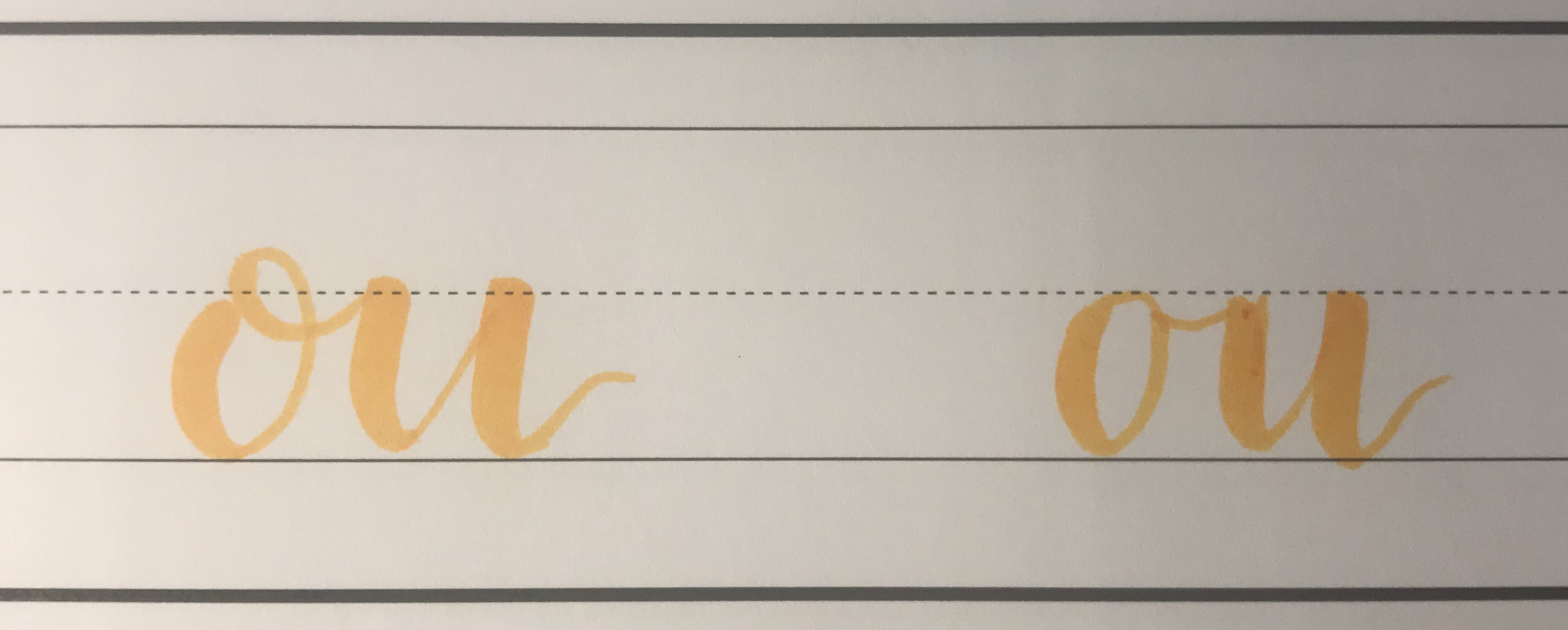
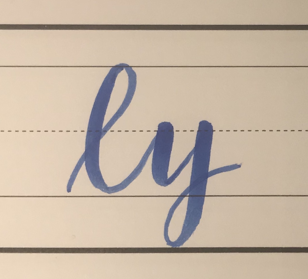
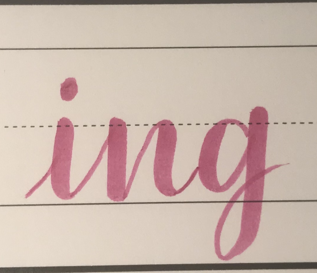
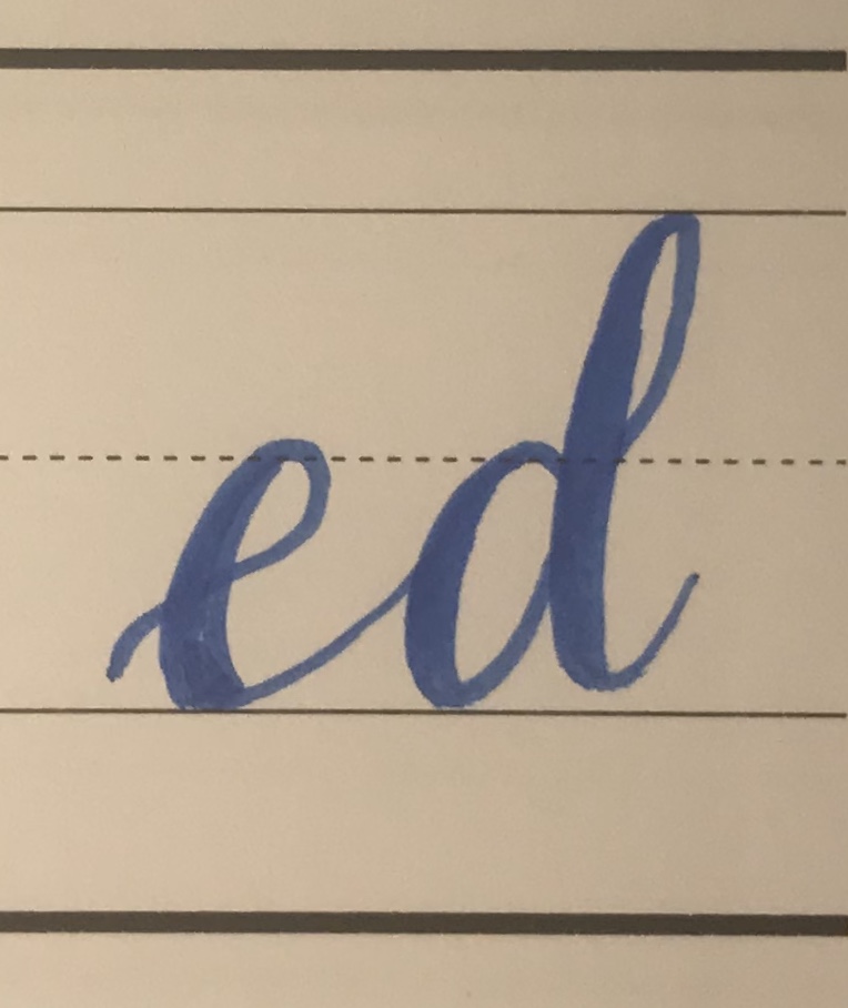
Pick a letter you struggle with, and write it over and over making little changes until you are happy with it, then write it the way you like it over and over and over… etc. Don’t be afraid to change your approach if something isn’t working for you. You can also ask me any questions in the comments and I will help in any way I can!

So that’s what I’ve got for you- use these suggestions and you will improve! Be patient and keep going!

Modern Calligraphy: Common Letter Transitions

Heyyyyy! Okay, so I have been covering the basics, (click here if this seems too advanced) but now I’m going to move into actually writing letters! For some people, jumping right in to writing letters is how they learn best. The previous posts I have made leading up to this are really just to give you the absolute best chance at success, but if you have landed here- welcome! Dive right in if that’s how you roll!

If you’re looking for more beginner practice sheets, you can find them here.

Sometimes writing an individual letter comes easily, and you don’t run into any problems until you start connecting letters to one another. I’m going show you a few different ways you can practice some of the letter transitions that come up often.

If you can comfortably do all of these letter transitions you will be far more comfortable when you are lettering full words/ sentences/ etc. I would love to see your practice sheets- drop a picture of them or any questions in the comments! Thanks for reading (& writing!)

Beginner Modern Calligraphy Exercises

One of the most “popular” types of hand-lettering currently is referred to as modern calligraphy or brush lettering. I spoke in my last post about the basic principal behind this style (& many others) being that there is a thin up stroke, and a gradually thicker down stroke (Learn about this terminology here!). Today I am going to go through some exercises that are a great way to put this principal into play, and that will prepare you for success as you learn.

I am going to use the crayola classic markers for these examples, but these same exercises can be used with brush pens as well!

The first, and most basic exercise is a simple curved zig-zag. This will help you get the hang of how to transition between an up stroke and a down stroke. This is probably the most valuable movement to master in modern calligraphy. With the crayola classic markers, you want to be on the very tip for your up strokes, and gradually tipping your marker to the side to utilize the angled side and thicken your lines on your down strokes. With a brush pen, these movements are created by putting lighter or heavier pressure on the paper. If you are doing faux-lligraphy with any other writing utensil, you will start with a curved zig-zag that is the same thickness throughout, then add your down strokes in, as explained in this post.

Another excellent exercise is making loops. This movement is present in many letters, and is a little more difficult to master than the zig-zag pattern.

I like to combine these two movements to practice letter transitions also.

The last one I’m going to show you today, is what I called Crazy 8’s. I’m sure there is a more sophisticated name out there, but I’m not going to find out what it is because I like Crazy 8’s better, I’m sure.

Keep practicing these until you can comfortably do them, and you will be in a great shape when you start lettering words!

I have some practice sheets using these exercises available in my Etsy Shop- here! As well as blank sheets with guide-lines here! Thanks so much for reading (&writing)! If you have questions, I am happy to help, just drop a comment below!

Intro to Modern Calligraphy

Hey-Oh! So I’m writing my first instructional post today! If you have any questions at all, please comment and I will answer to the best of my ability. Chances are, if there is something you’re wondering about, someone else is wondering, too!

First, I’m going to go over some terms that come up a lot in hand-lettering so that everyone can better understand the process as I explain it. Then I will show you how to do some “faux” lettering. It sounds like you’ll be cheating, but ya know what? It is a great way to start out because it gives you more room for correction, it still looks pretty, and it gives you an excellent foundation to build on!

Like any skill or trade, there are terms that are used in hand-lettering that don’t really come up otherwise. I’m going to try and cover the most commonly used ones, and the ones that I think will most benefit you to know as you start out.

Upstroke: Any time the marker is going in the upward direction.


The darkened areas in this letter are the upstrokes.


Down-stroke: Anytime the marker is going in a downward direction

The darkened areas in this letter are the down-strokes

Guide Lines: These refer to a set of lines, sometimes drawn in pencil to use and be erased later, that are meant to keep your letters at the same height and angle.

Descriptions are listed on (above) the line they are describing

The term slope refers to the angle at which you are writing. In the example below, the slope line would be straight up and down.

An example of Guide Lines with vertical slope:

The S is the only capital letter, and therefore the only one reaching to the Cap Height line
The t‘s and h are ascending letters that reach the ascender line
The g is a descending letter that dips down to the descender line
All other lower case letters stay between base line and x-height

If you want to italicize your lettering, your slope line would tilt on an angle, and your letters would follow that line.

Step By Step

Without further adieu, you may start with any marker, but I will be using the classic crayola markers to start out. You can do so much with these! I am going to start with a word, then go step by step to show you how to add to it. You can start with any kind of paper you want, but I would recommend using grid paper or something that allows you to utilize the guide lines from above. (Shameless plug: I have a sheet with the guide-lines available for digital download in my Etsy shop, here!)

The basic principal of the modern calligraphy is that you want to have a thin line on your upstroke, and a thicker line on your down stroke. In order to create this look, we will start by just writing a word (or just a letter if you prefer!) in cursive using just the tip of the marker.

Step 1

The next step in to thicken your down strokes. The more vertical the line is, the thicker it should be. The curve where you are transitioning from a upstroke to a down stroke or vice versa is the trickiest part to get down. You want to start in the middle of the curve, and thicken the line gradually, making the middle of your down stroke the thickest part.

Step 2

Then you can fill in the gaps- and voila! You have now done faux-lligraphy!

Step 3

Once you understand the basic idea behind the up and down strokes, you can begin using the markers to create those thicker and thinner lines without having to add anything to them. My next post will explain how to practice & prepare for that. Thanks for reading (&writing)! Drop any questions in the comments!

Lettering Love

Helllllloooo! Thank you so much for clicking the clicky thing and coming to check out my new blog! My name is Lindsey, and for my first post I thought I would explain how I started hand-lettering, and what you can expect to see on this blog.

It was May of 2016 when I came across a planner method called Bullet Journaling. I am guessing the original creator of this idea (Ryder Carrol) could not have know how explosive it would be, but it has really morphed into a huge range of people using different levels of creativity to expand on his original idea. When I discovered Bullet Journaling, I joined a facebook group called “Bullet Journal Junkies.” It was in this group that I realized I had found my people. I always thought my love of school supplies, and my desire to have a million pens and markers, and the feeling I got when writing on a super smooth piece of paper were just things that made me “different”. Turns out, I share those feelings with a very large and active community of paper, pen, marker, and planner addicts.

It was in this facebook group that I first learned about hand-lettering and what it means in our modern age (i.e. not your mama’s calligraphy. But I do love your calligraphy, Mom!). It no longer requires a square-tipped marker or pen, it has endless creative possibilities, & it will give you a reason to buy all the office supplies you can’t yet justify purchasing! I’m here to tell you- buy that set of brush pens. Yes, the set of 196. Yes, you can use them all. No, your spouse will totally not mind!

But seriously, I love doing this. I want to help people just starting out, and people who want to challenge themselves. I want to create posts that are useful, and keep learning how to do this fun and inspiring. I want to help people develop and be blessed by the joy that creating something beautiful can give them. And to find the humor in our mistakes, but keep at it. I truly believe everyone can learn how to do this- it’s just a matter of how much time it will take to get there. I hope I can help make the process enjoyable for you no matter what your skill level is!

I will also be sharing some of my planner on this blog. I can no longer call it a Bullet Journal because it, too, has morphed into something else. A lot of my hand-lettering practice came from creating pages in this planner, and it’s an excellent way to watch yourself progress as you practice and improve!

I appreciate you taking the time to read this- and I will be back soon with new posts!