
Hey-Oh! So I’m writing my first instructional post today! If you have any questions at all, please comment and I will answer to the best of my ability. Chances are, if there is something you’re wondering about, someone else is wondering, too!
First, I’m going to go over some terms that come up a lot in hand-lettering so that everyone can better understand the process as I explain it. Then I will show you how to do some “faux” lettering. It sounds like you’ll be cheating, but ya know what? It is a great way to start out because it gives you more room for correction, it still looks pretty, and it gives you an excellent foundation to build on!
Like any skill or trade, there are terms that are used in hand-lettering that don’t really come up otherwise. I’m going to try and cover the most commonly used ones, and the ones that I think will most benefit you to know as you start out.
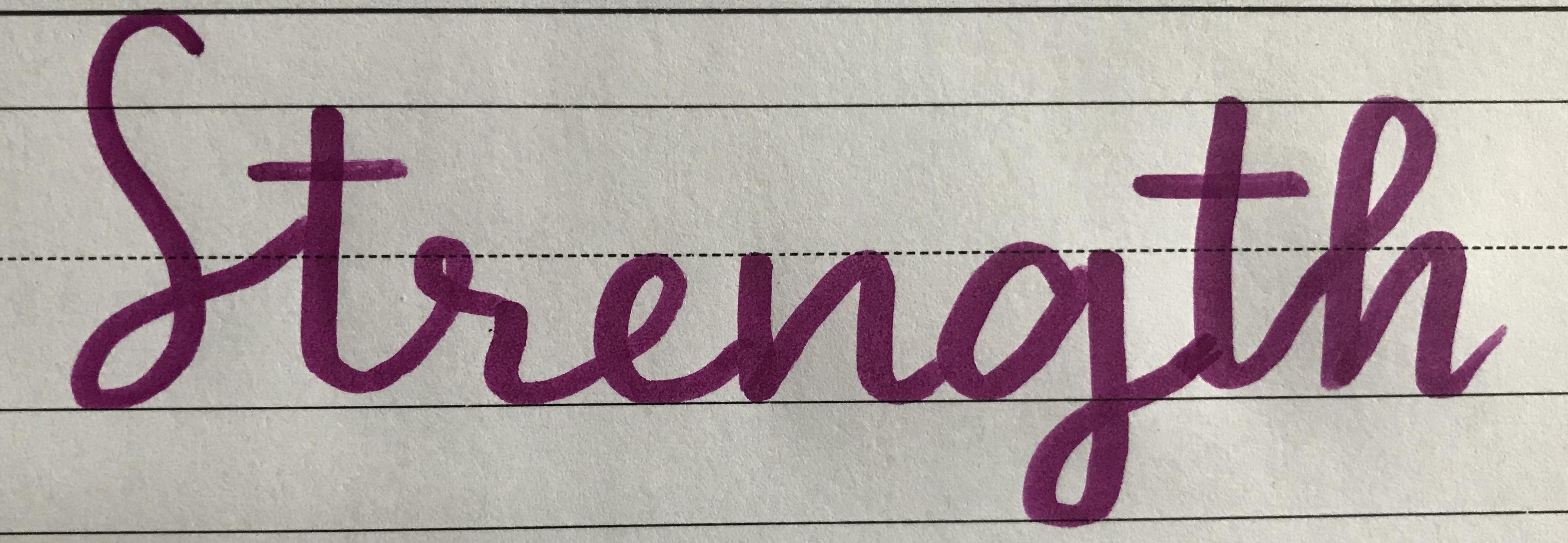
Upstroke: Any time the marker is going in the upward direction.
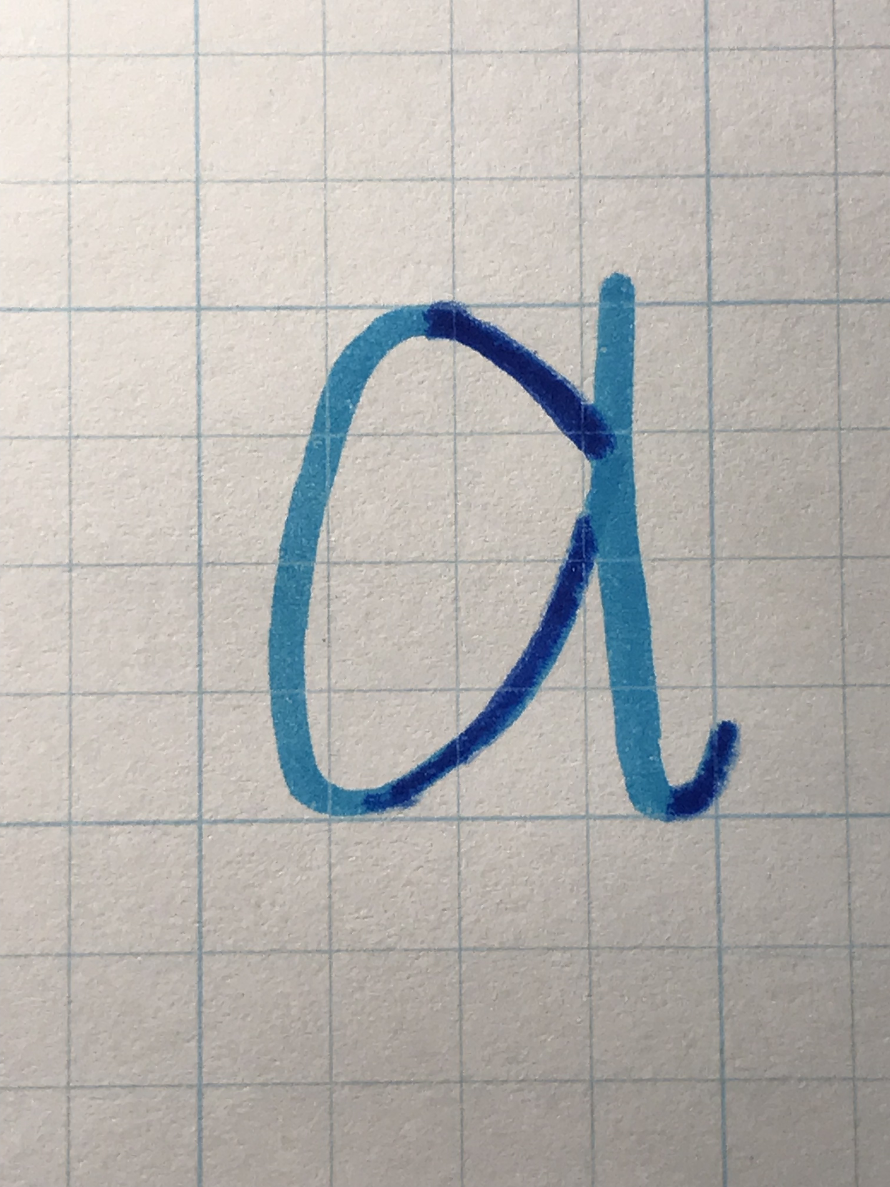
The darkened areas in this letter are the upstrokes.
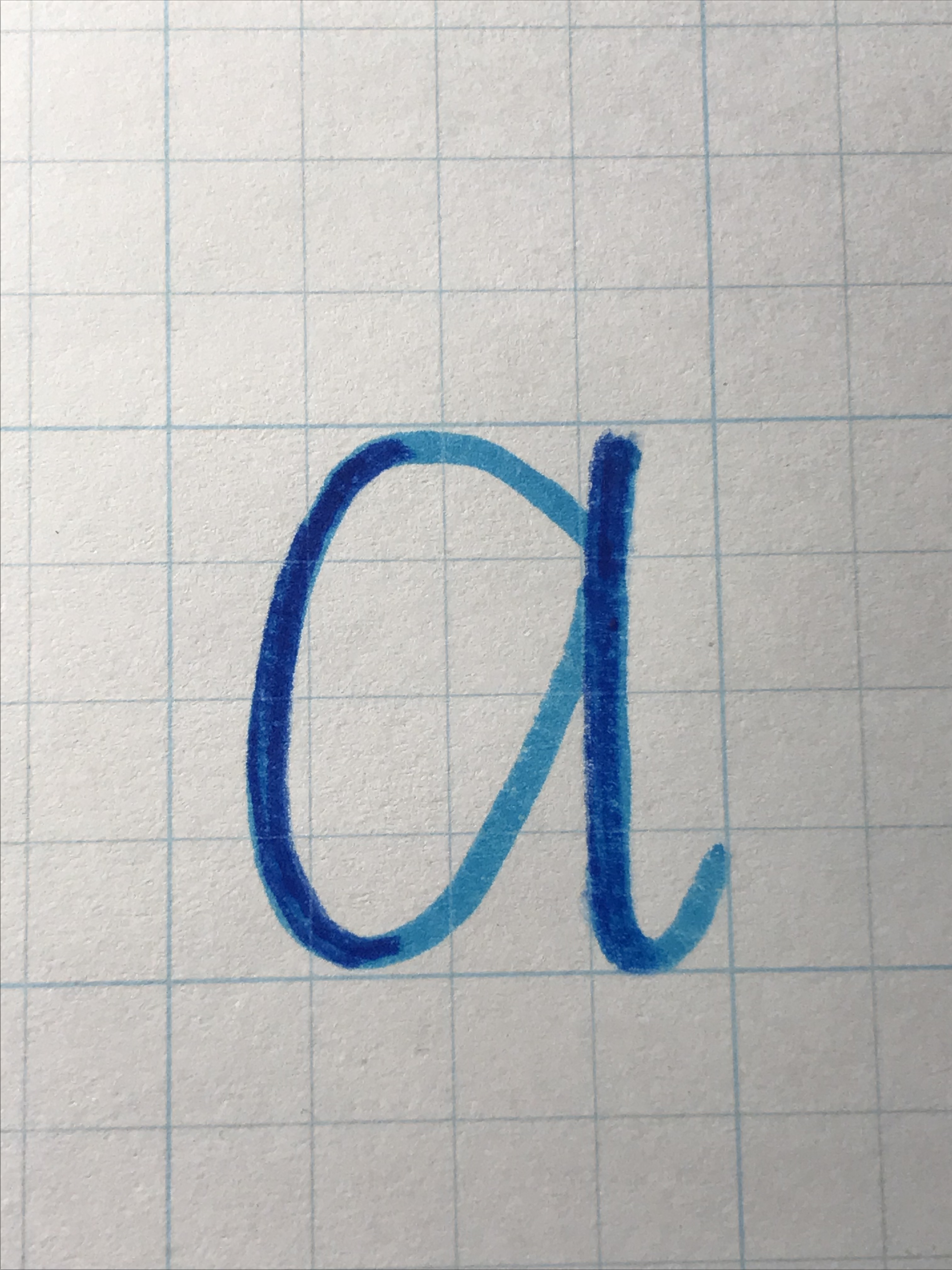
Down-stroke: Anytime the marker is going in a downward direction
Guide Lines: These refer to a set of lines, sometimes drawn in pencil to use and be erased later, that are meant to keep your letters at the same height and angle.
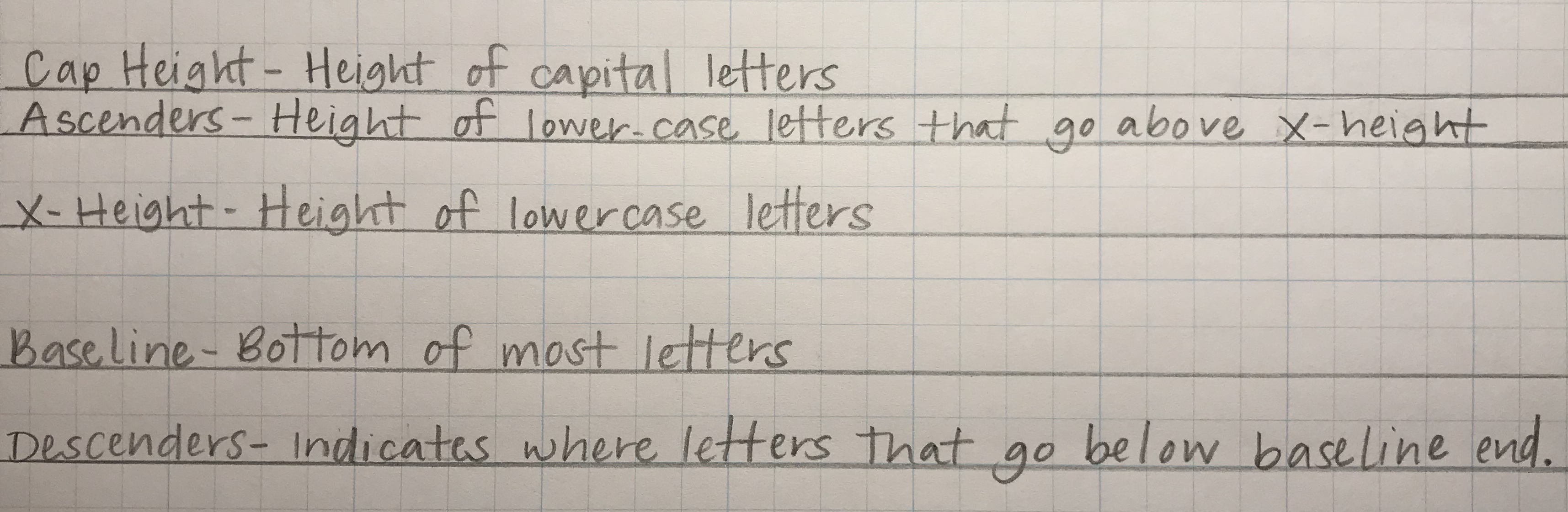
The term slope refers to the angle at which you are writing. In the example below, the slope line would be straight up and down.
An example of Guide Lines with vertical slope:
The t‘s and h are ascending letters that reach the ascender line
The g is a descending letter that dips down to the descender line
All other lower case letters stay between base line and x-height
If you want to italicize your lettering, your slope line would tilt on an angle, and your letters would follow that line.

Step By Step
Without further adieu, you may start with any marker, but I will be using the classic crayola markers to start out. You can do so much with these! I am going to start with a word, then go step by step to show you how to add to it. You can start with any kind of paper you want, but I would recommend using grid paper or something that allows you to utilize the guide lines from above. (Shameless plug: I have a sheet with the guide-lines available for digital download in my Etsy shop, here!)
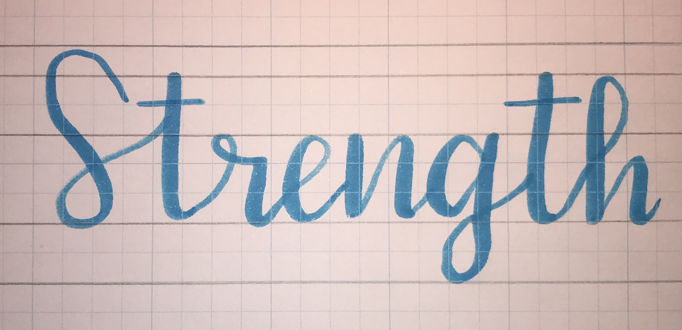
The basic principal of the modern calligraphy is that you want to have a thin line on your upstroke, and a thicker line on your down stroke. In order to create this look, we will start by just writing a word (or just a letter if you prefer!) in cursive using just the tip of the marker.
The next step in to thicken your down strokes. The more vertical the line is, the thicker it should be. The curve where you are transitioning from a upstroke to a down stroke or vice versa is the trickiest part to get down. You want to start in the middle of the curve, and thicken the line gradually, making the middle of your down stroke the thickest part.

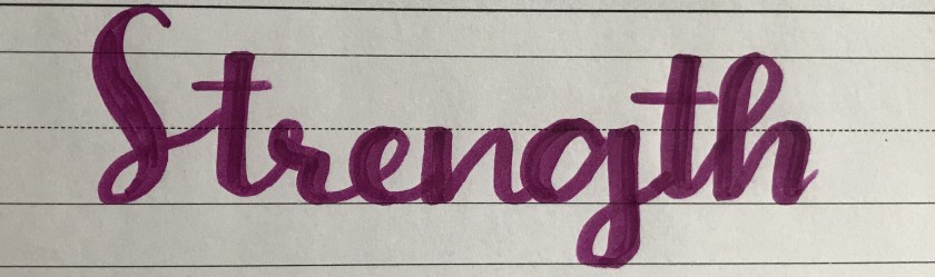
Then you can fill in the gaps- and voila! You have now done faux-lligraphy!
Once you understand the basic idea behind the up and down strokes, you can begin using the markers to create those thicker and thinner lines without having to add anything to them. My next post will explain how to practice & prepare for that. Thanks for reading (&writing)! Drop any questions in the comments!
